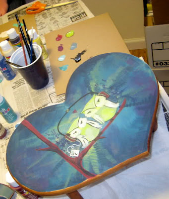
Okay - I love to draw...it's no lie. But I don't consider myself a expert painter in anyway...only because...I feel like the way I paint...is really basic. I thought...hey - basics are good, right? And knowing that some people feel like painting is a little unattainable... I wanted to show you a little stool that I painted and show you that painting in layers can be simple...
Get your materials out
Sketch out your idea... just basic shapes...remember...you don't need to know how to draw in order to get a shape on the canvas.
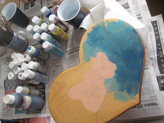
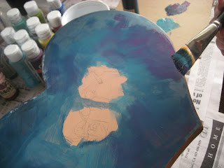
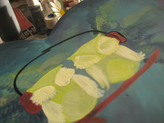
Keep the layers coming! I find the the more whimsy I put into my brush strokes, the more interest there is visually...so get IN there...don't be shy! Just a little tip tho... try limiting the colors you're working with and take your time...if you use too many colors, you'll end up with a brown tone to everything...but you can use MORE color if you wait for paint to dry. Just don't look at it for too long. :-)
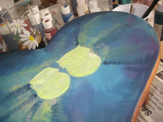
Simple lines for shapes also helps to define something without really overpowering the painting...try a dark gray instead of a black...that helps to tone down the outline. I also used limited colors on my owls so that they stand out against the whimsy of my background. Just yellow-green with some off-white.
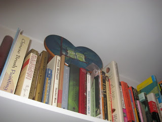
When you're done...put a protective varnish on your work of art and display it!
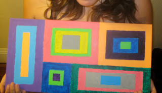
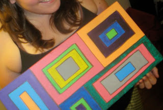
Now: I know what you're saying...it still looks to complicated. No...really... look at this... my old roommate wanted to paint (she was inspired by me) and she "can't draw"... so I had her do a simple square/rectangular painting...and then said...once you're done making your shapes...come back over them and add black outlines.
Look at how simple just a two layered painting can be...she was very proud of herself. :) Imagine if you scanned it and then made a bookmark...or a series of cards?
Upcoming Tutorials include:
Feather Hair Accessories, MINI PIES!!!, What to do with a 100 vintage buttons, additional painting technique lessons and MORE! Keep on keepin' on...this stuff is FUN!
If you're an Etsy seller in the San Francisco Bay Area, contact Jen from Mama's Magic Studio about joining SFEtsy!


2 comments:
That was great, thanks! I should try using grey instead of black for my outlines, that's a good idea! Also I love the way your background looks.
this is fantastic!!! as someone who definitely needs to start with the basics, this is very inspirational -- and i'm excited to see what might be coming next! thanks for sharing!
Post a Comment